


Open with a sharper rule than most style guides: not every collegiate typeface gives you an authentic letterman jacket font look. On a real jacket, letter width, stroke weight, spacing, contrast, and production method decide whether the result feels classic, oversized, minimal, or underground. A wide block letter can look stronger than a fancy “varsity” face. A thin one can collapse the second it hits chenille, twill, or a small chest placement.
That's why this comparison matters for streetwear. I'm judging each option by silhouette, embroidery or appliqué fit, layering, licensing, and how well it sits inside Stockholm's restrained monochrome direction. The cleanest reference point is 2Ghetto's black-and-white heavyweight approach, which keeps the jacket honest, direct, and easy to wear with oversized tees and hoodies. The seven picks below move from pure classic to more flexible brand-system territory.
Table of Contents
- 1. 2Ghetto Heavyweight Letterman Jacket
- 2. Beau's Varsity by Beau Williamson
- 3. Collegiate by K-Type
- 4. Graduate by Eduardo Tunni
- 5. United by House Industries
- 6. FTY Old Sport by The Fontry
- 7. Collegeblock 2 by Sharkshock
- Letterman Jacket Fonts, 7-Way Comparison
- Build the Lettering Around the Garment
1. 2Ghetto Heavyweight Letterman Jacket
A restrained varsity jacket needs a blunt letterman jacket font, not decorative lettering. 2Ghetto's heavyweight letterman design establishes that direction through a black-and-white treatment that keeps the letter visible and the garment easy to style. Its stripped-back silhouette suits Stockholm-inspired streetwear, where proportion, texture, and negative space carry more weight than extra color or ornament.
Why it reads right
The jacket works because the letter functions as a clear graphic block. A bold form remains legible across a heavyweight body, over hoodies, and beneath a larger outer layer. It also gives embroidery or appliqué enough surface area to hold its shape, while narrow counters and delicate details would lose definition in chenille or twill.
Placement matters just as much as the typeface. The brand's letterman jacket frame guide treats the jacket as a system of proportion and positioning, not a blank surface for oversized decoration. Keep the mark deliberate, with enough surrounding space to preserve the silhouette.
Practical rule: match a minimal jacket with a compact, block-led letterform. Skip decorative flourishes that compete with the body, sleeves, or ribbing.
Best use and pairing
Use this direction for a large chest initial, a short appliqué wordmark, or a single emblem that needs to carry the front of the garment. It pairs cleanly with a boxy tee, relaxed denim, or straight trousers. The 2Ghetto Oversized Boxy Tee supports the same volume through dropped shoulders and a loose cut, leaving room beneath the jacket without compressing the layers.
That pairing keeps the jacket as the focal point while avoiding a costume-like school-uniform effect.
Production caution
Set the lettering before choosing the decoration method. Chenille favors broad, simple shapes with generous spacing. Twill appliqué can handle firmer edges, but it still needs a silhouette that reads at a glance. Check the font at its final patch size, then test the letter against the jacket's body color. If the stroke becomes narrow or the counters close, revise the artwork before production. Licensing also belongs in the production brief, especially if the same letterform will appear across garments, packaging, and campaign graphics.
2. Beau's Varsity by Beau Williamson
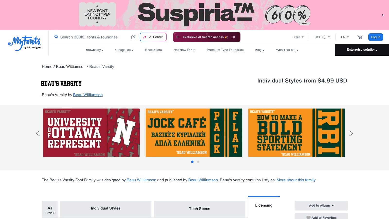
Beau's Varsity is the direct answer when you want the most obvious letterman jacket font silhouette without overthinking it. The face is built around blunt athletic forms, so it reads like a stitched school mark instead of a fashion experiment. On apparel, that matters more than cleverness. If the goal is instant varsity recognition, this is one of the cleanest choices in the group.
Strong shape, simple job
This font's biggest advantage is silhouette. The letters are slabby and heavy, which makes them natural for all-caps wordmarks on jackets, patches, and sports graphics. That all-caps behavior is essential, because varsity lettering has always favored a stable, block-forward voice. On a chest patch, Beau's Varsity gives you the old-school school-spirit read without needing outlines, shadows, or fake distressing.
Best fit: chest initials, campus-style names, and short phrases that need to survive embroidery or chenille treatment.
Licensing and production
Beau Williamson's MyFonts page makes the commercial path clear, with desktop, web, app, and digital ad licensing tiers available through the same product page. That's useful for a small label that wants one face across garment graphics, product pages, and campaign art. The downside is obvious, though. It's a single style, so you get one strong note instead of a full system.
How I'd use it
Use Beau's Varsity for direct recognition, not subtle branding. It works when the letter needs to feel earned, visible, and immediate on a jacket or crewneck. It's less interesting if you're building a broader identity with multiple weights or mixed typography, because the font doesn't give you much room to stretch.
3. Collegiate by K-Type
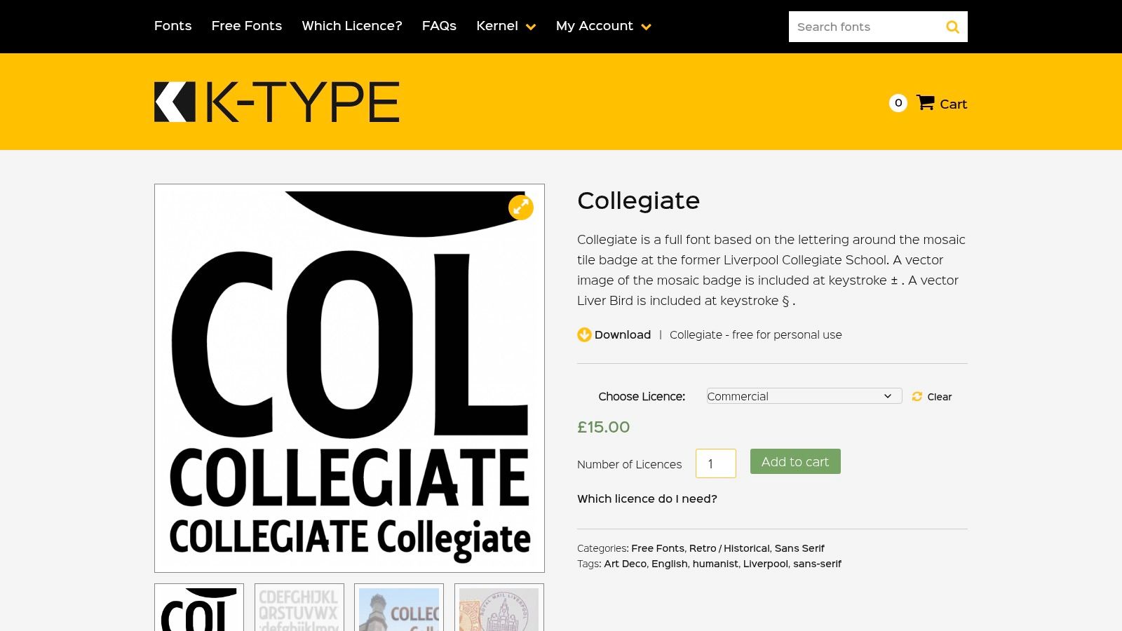
Collegiate is the font I'd choose when the brief is “keep it traditional, keep it readable, keep it clean.” It has the straight-sided athletic look people expect from varsity apparel, and it doesn't try to sell you a fake vintage effect. That restraint makes it especially useful for Scandinavian streetwear, where the outfit usually benefits from less noise, not more.
Built for applique and embroidery
The strength here is geometry. Straight sides and clean caps make Collegiate easy to translate into applique, embroidery, and patch work. That matters because the varsity look breaks down fast if the letter edges get too soft or stylized. The font also pairs naturally with a script name or a smaller year mark, which keeps the hierarchy legible when the jacket uses multiple placements.
Best fit: team names, school-style initials, and jacket fronts where the main letter has to stay simple.
The brand's own layout thinking around varsity pieces is useful here, especially the way a chest letter, sleeve markers, and supporting details should be separated rather than crowded together. That same logic appears in 2Ghetto's letterman jacket layout note, and it's the right mindset for Collegiate too. Let the main wordmark breathe. Don't stuff every surface.
License check and caution
K-Type's distribution is straightforward, but you still need to verify the exact license version before using any file you found online. Some copies floating around are personal-use only, and that's a bad place to discover a rights problem after a sample stitchout. Keep the font on a short leash, use it for clean wordmarks, and stop before it starts pretending to be decorative.
Why it works in Stockholm styling
Collegiate does well in monochrome because it depends on proportion, not color. On a black jacket with white lettering, it delivers a direct campus read that still feels current when the rest of the outfit stays oversized and minimal. That's the sweet spot for streetwear that wants heritage without looking nostalgic.
4. Graduate by Eduardo Tunni
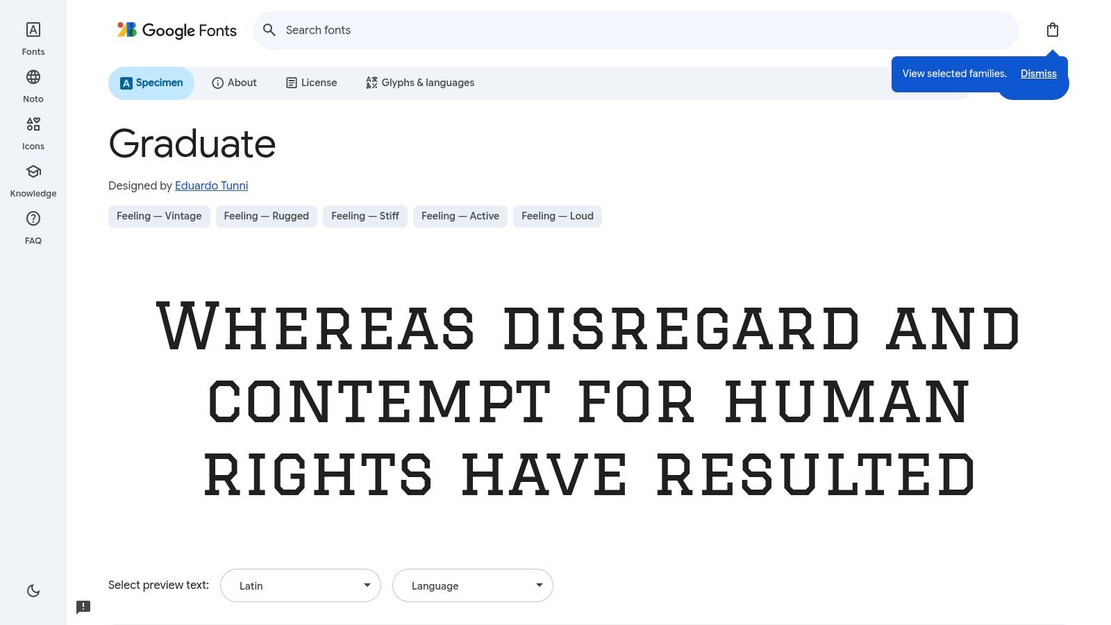
Graduate is the practical choice for digital-first work. If you're prototyping a jacket graphic, building a Shopify header, or laying out a lookbook, it gets the job done without licensing friction. It's not the most tactile varsity face in the lineup, but it's one of the easiest to use across web and print.
Best for previewing before production
Google Fonts makes Graduate easy to test in a live environment, which matters when you're trying to judge word length, spacing, and cap height against a jacket mockup. The face has a condensed, institutional feel that reads as collegiate without forcing a fake patch effect. That makes it a smart tool for early-stage design decisions, especially when you're deciding whether a name looks better in a chest position or as a smaller support line.
Use it when the garment isn't final yet. Graduate is strong for web headers, commerce pages, and quick visual mockups, then you can move to a more tactile production face later.
What it lacks
Graduate is only one style, so it doesn't give you a broader hierarchy when you need matching weights. It also doesn't deliver the chunky chenille mood that people associate with the classic jacket letter. On a heavyweight piece, that can be a plus or a minus depending on the brand story. For a minimalist label, the cleaner read is often better.
Where it fits in a streetwear system
This is a good font for a brand that wants consistent digital presentation across product pages, campaign copy, and simple garment graphics. It's especially useful when the jacket itself carries enough weight visually and the typography needs to stay calm. In other words, Graduate is for clarity, not drama.
5. United by House Industries
United is the most serious brand-system option in the set. It doesn't pretend to be a chenille patch font, and that's exactly why it's valuable. If a label wants a scalable athletic voice across apparel, tags, wordmarks, packaging, and campaign assets, this family gives you room to build without painting yourself into one varsity mood.
Not a patch font, still a strong apparel tool
United's power comes from flexibility. The Sans, Serif, and Italic cuts let you build a clean hierarchy, which is useful when a collection needs consistency across garments and digital assets. For a jacket line, that means you can use one voice for the chest mark, another for care labels or supporting graphics, and a third for campaign text without breaking the brand system.
The varsity lesson still matters here. Lettering on outerwear has to read from a distance, and that means weight, spacing, and contrast matter as much as style. United handles that with a more refined edge than a pure school-letter face.
Use this when the jacket is part of a wider identity, not a one-off graphic.
Licensing and cost logic
House Industries sits in a different lane from single-style fonts, so the investment is higher. That makes sense if you're designing across multiple products and seasons. It's the wrong choice if you only need one chest wordmark and a patch layout. It's the right choice if the label needs a language rather than a single look.
Best use in Scandinavian streetwear
United works well when you want sports energy with less nostalgia. In monochrome, it feels polished instead of collegiate-cosplay. That suits Stockholm streetwear, where a jacket usually has to hold up next to clean knits, heavy tees, and sharp outerwear without shouting.
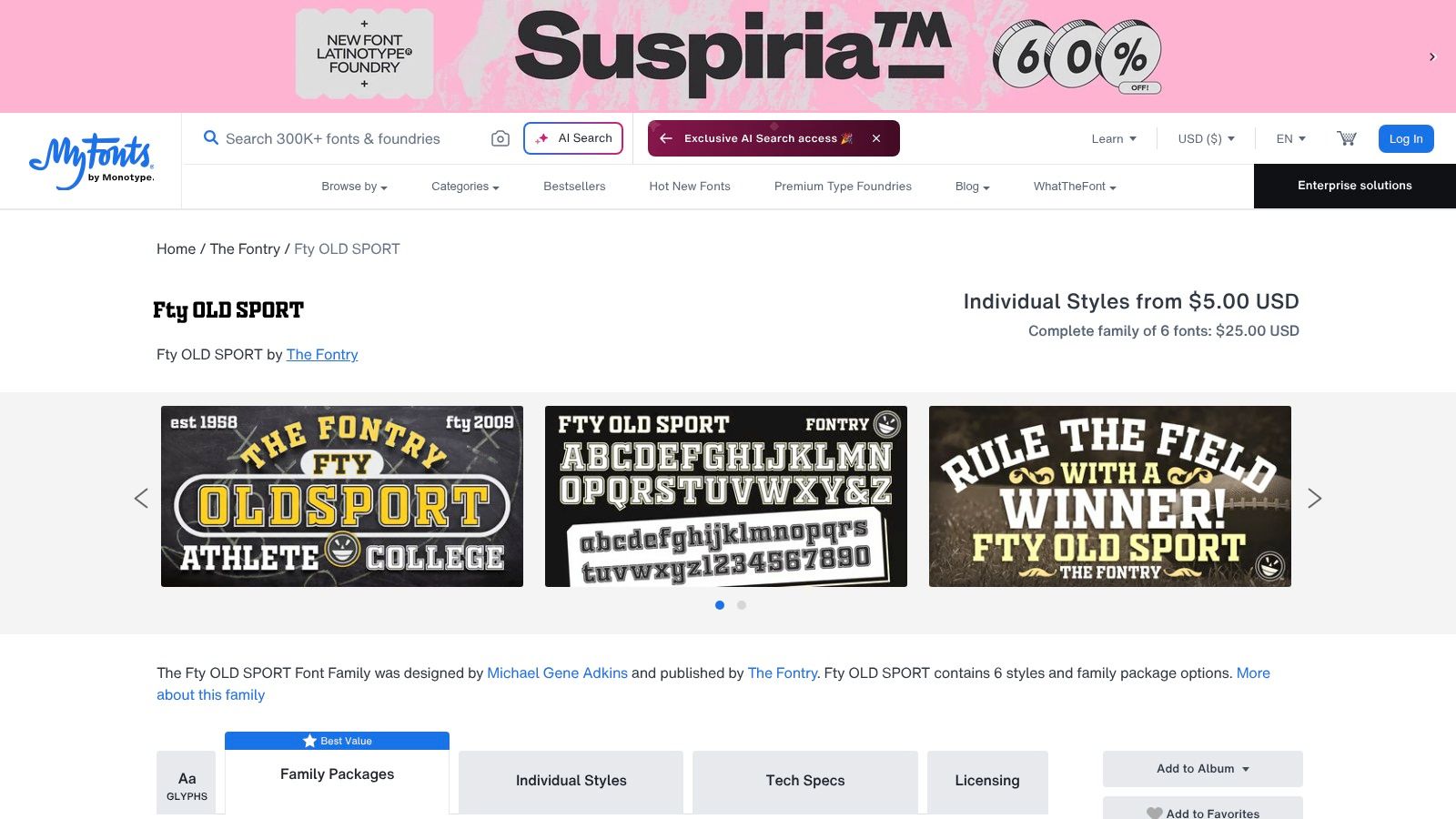
6. FTY Old Sport by The Fontry
FTY Old Sport is the most useful font package here if you want layered apparel graphics. The coordinated styles make it easier to build stacked, two-color, or school-style compositions without forcing every line into the same weight. For hoodies and varsity jackets, that matters because the garment often needs a headline, a supporting line, and a secondary treatment that still feels related.
Best for layered compositions
This set is built for school and sports energy, especially when you want a main collegiate line and a secondary athletic line that doesn't feel pasted on. The “College” and “Athletic” style family makes it easier to design around hierarchy instead of treating every word as a standalone headline. That's useful on heavier garments where the typography needs to support the shape of the body, not just sit on top of it.
Practical rule: use the strongest cut for the main chest word, then let the supporting style stay quieter. Don't fight the jacket with equal-weight lines.
Apparel-first logic
FTY Old Sport feels like a graphics package made by people who understand printing and signage, which is why it's attractive for garment work. It suits stacked compositions, twill treatments, and the kind of campus reference that still reads well on hoodies. It's also the right sort of face when you want a vintage athletic flavor without committing to a museum-style reproduction.
Tradeoff to respect
The character set is narrower than the larger retail superfamilies, so don't expect the same depth of system-building as you'd get from a premium brand font. Use it where it performs best, on apparel graphics with clear hierarchy and a strong streetwear attitude. In a minimalist drop, it can become the loudest element fast, so keep the rest of the outfit restrained.
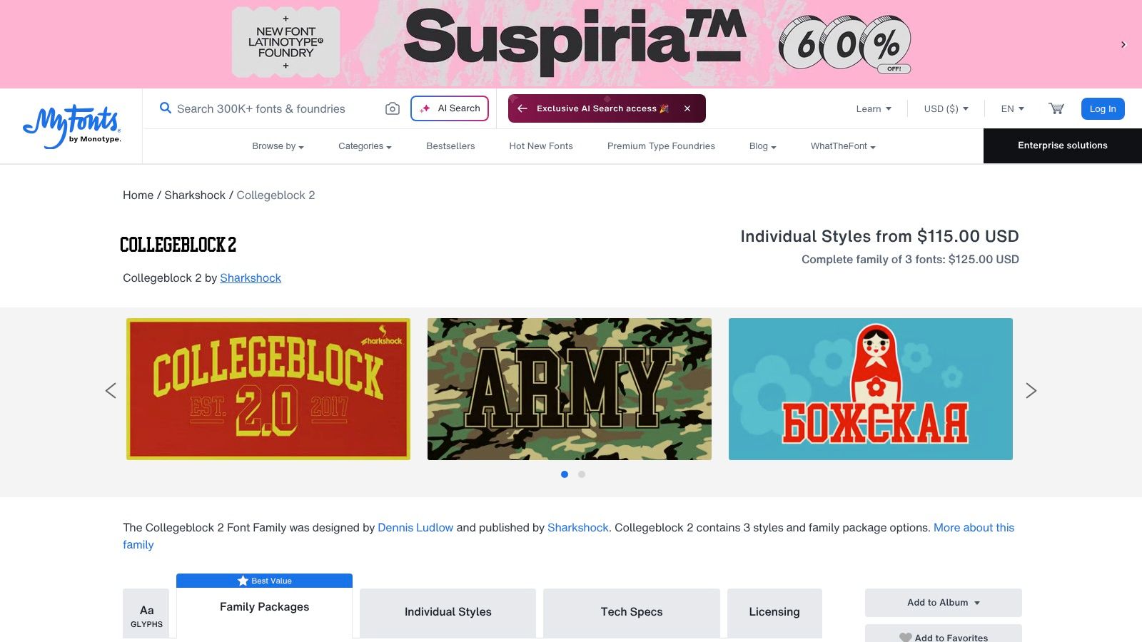
7. Collegeblock 2 by Sharkshock
Collegeblock 2 adds dimensional punch to varsity lettering through its extrude and outline variants. That makes it a better fit for oversized front graphics than flat block faces that disappear on a bulky jacket. On heavyweight crewnecks and outerwear, the extra depth gives the wordmark more presence without demanding extra color.
Where the dimensional effect helps
The outline and extrude styles carry more visual mass, which helps when the garment needs a clear focal point. They suit jackets, crewnecks, and layered campus references because the type still reads as varsity, just with more attitude. For Stockholm-inspired monochrome streetwear, that sharper contour works well with black, white, and grey palettes.
Keep the scale honest. Decorative variants lose clarity fast if the letters get too small or the kerning gets too tight. Use this font for larger placements, not tiny chest hits or sleeve details.
Best fit: oversized front graphics and medium-to-large jacket lettering, not small sleeve details.
Production caution
If the lettering will be made as patches, twill, or screen print, check the outlines in production artwork before approval. Dimensional styles can blur when they are compressed, especially on thick outerwear where fabric texture already adds noise. Chenille and patch systems reward bold forms and punish decoration that tries too hard. The same rule applies here.
Collegeblock 2 also needs a clean license check before you build a full apparel run around it. That matters more than style when the design is meant for release, not just a mockup.
Why it belongs in this list
Collegeblock 2 bridges classic college lettering and a more stylized streetwear finish without losing the varsity signal. For a label that wants a tougher graphic read, it is a smart choice. In monochrome, the outlined forms feel sharp and contemporary rather than nostalgic.
Letterman Jacket Fonts, 7-Way Comparison
| Item | 🔄 Implementation complexity | ⚡ Resource requirements | 📊 Expected outcomes | Ideal use cases | Key advantages (⭐ 💡) |
|---|---|---|---|---|---|
| 2Ghetto Heavyweight Letterman Jacket | Low for buyer (ready-made); brand handles production/logistics | Higher material/manufacturing cost; regional (US/EU) shipping limits | Durable, versatile staple with collector appeal | Streetwear wardrobes, layering, collectors | ⭐ Durable, authentic varsity; 💡 limited drops, act quickly |
| Beau's Varsity, Beau Williamson (MyFonts) | Low technical setup; choose appropriate license tier | Affordable one‑style purchase; clear commercial licenses | Classic varsity display that reads well on patches/headlines | Small commercial apparel projects, wordmarks | ⭐ Unmistakable varsity silhouette; 💡 single style, limited OpenType |
| Collegiate, K‑Type | Low; straightforward install and use | Lightweight files; available via foundry/marketplaces | Recognizable college look suited to applique/embroidery | Team tees, name scripts, collegiate apparel | ⭐ Traditional collegiate voice; 💡 verify license for some online versions |
| Graduate, Eduardo Tunni (Google Fonts) | Very low; easy web embedding via Google Fonts | Zero cost (open source); fast web performance | Clean collegiate display for web/print prototyping | Shopify headers, lookbooks, quick prototypes | ⭐ No licensing friction; 💡 single style limits hierarchy |
| United (Sans/Serif/Italic), House Industries | Higher (large superfamily selection and spec'ing) | Higher cost; extensive family and OpenType support | Polished, scalable brand system across touchpoints | Full brand systems, sports identities, packaging | ⭐ Highly flexible/professional; 💡 pricier than single-display fonts |
| FTY Old Sport, The Fontry (MyFonts) | Moderate; multiple coordinated styles enable layering | Affordable family pricing; narrower character sets | Purpose-built layered varsity/appliqué effects for apparel | Stacked/outline designs, team graphics, hoodies | ⭐ Apparel-focused family; 💡 less doc/support than big foundries |
| Collegeblock 2, Sharkshock (MyFonts) | Low–moderate; decorative variants need careful scaling | Packaged family at accessible price point | Bold front-of-chest wordmarks; 3D/outline display options | Varsity jackets, heavyweight crewnecks, layered comps | ⭐ Versatile display variants; 💡 decorative styles require kerning care |
Build the Lettering Around the Garment
Choose Collegiate or Beau's Varsity when you want direct classic recognition. Choose Graduate when you need a clean digital prototype that's easy to test on web and print. Choose FTY Old Sport when the graphic needs layered apparel treatment with a stronger campus feel. Choose Collegeblock 2 when you want outlined or dimensional compositions. Choose United when the jacket is part of a wider identity system, not a one-off graphic.
Before production, test the actual word length at jacket scale. Inspect spacing in all caps, confirm the license, and preview the lettering against the garment's monochrome palette and oversized proportions. That's where bad choices show up fast, especially on heavyweight outerwear where silhouette matters as much as type.
For the cleanest Stockholm-influenced result, keep the typography blunt, balanced, and unapologetically legible. That's the lane 2Ghetto already occupies with its restrained black-and-white streetwear direction. If you want the product context that matches this approach, browse the verified 2Ghetto Heavyweight Letterman Jacket page and use it as the reference point for your next varsity-style build.
2Ghetto makes unisex streetwear with a monochrome edge, and that includes outerwear, tees, and hoodies designed for clean layering. If you're building around a letterman jacket font, start with the jacket silhouette first, then match the typography to the garment's scale and mood. Visit 2Ghetto to see how the Stockholm-influenced approach translates into actual pieces.