


You can spot the problem before the first sample even ships. The mockup looks clean on screen, the chenille letter feels balanced, and the back art seems centered, then the jacket lands and the left chest is crowded, the sleeve patch sits in the wrong visual lane, and the whole piece reads like it was guessed instead of measured.
That gap usually isn't a creative problem, it's a production problem. A strong letterman jacket layout has to survive seams, ribbing, size grading, and the way embroidery shops place art on a curved garment, not a flat artboard.
Table of Contents
- Why Most Letterman Jacket Layouts Fail Before Production
- The Standard Visual Hierarchy for Varsity Jackets
- Exact Placement Measurements by Jacket Zone and Size
- Building a Production-Ready Layout Mockup
- Common Layout Mistakes and How to Fix Them
- Final Pre-Production Checklist for a Clean Layout
Why Most Letterman Jacket Layouts Fail Before Production
The first failure usually starts with a designer who treats the jacket like a poster. On screen, everything sits in perfect proportion. On the garment, the shoulder slope, placket, and rib trim change the way every element reads, so the same art that felt centered in a mockup can feel high, cramped, or visually drifting once it's stitched.
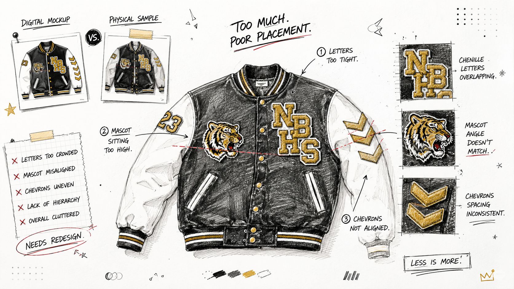
A lot of bad jackets also come from vague shop language. Saying “center it” leaves too much room for interpretation when the factory needs a seam reference, a collar reference, or a placket offset. The result is predictable, a chest graphic too close to the edge, a back piece that falls into the yoke, or a sleeve patch that sits where the arm naturally hides it.
Measurement first beats visual guessing
The biggest shift happens when the layout starts with landmarks, not feelings. On a real jacket, the designer has to think in terms of shoulder seam, center front, collar seam, and yoke line, because those are the points the shop can reproduce from size to size. That's why production teams care so much about placement charts and why a flat mockup without coordinates is usually just a promise, not a spec.
Practical rule: if the placement note can't be read by someone who has never seen the mockup before, it's not production-ready.
The historical layout logic also matters here. The modern form traces back to Harvard baseball in 1865, when the big Old English “H” on the chest established the front-letter template, and the shape later standardized into the familiar wool-and-leather jacket by the 1930s American Madness. That history still shows up in the way the jacket wants to be read, chest first, then supporting marks, then the larger back statement.
The Standard Visual Hierarchy for Varsity Jackets
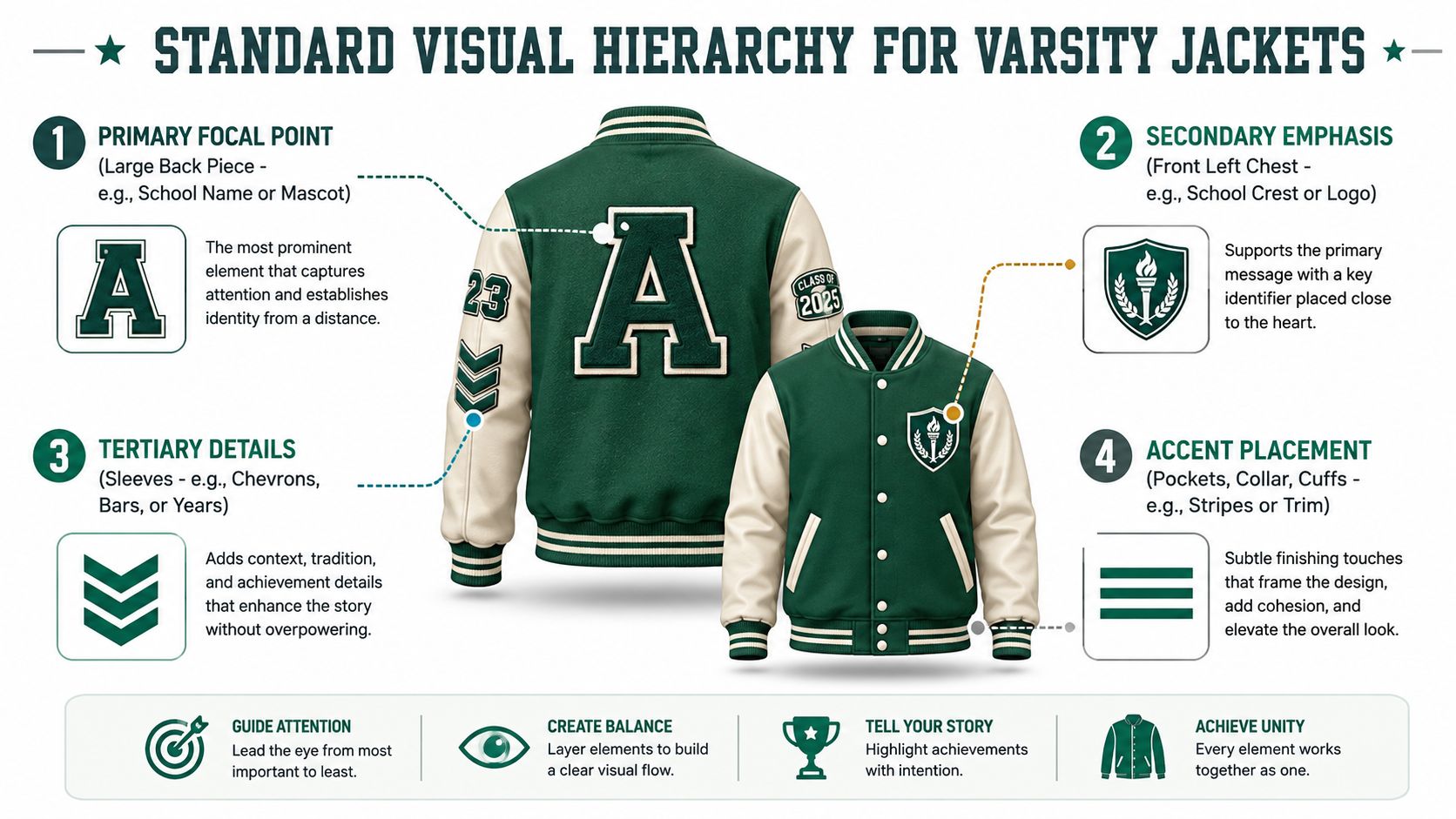
A jacket layout gets judged in the factory long before anyone sees a finished sample. If the front chest, back panel, and sleeves all try to lead at once, the piece reads crowded and the production team has no clean priority order to follow. A workable letterman jacket layout gives each zone a job, then keeps the artwork sized and spaced so the shop can build it on real garments, not just on a flat screen.
Chest first, because that's the identity anchor
The left chest carries the primary identity mark, usually the main chenille letter or school emblem. Treat it as the first placement decision, because every other element has to give it room. The right chest can hold a year, small crest, or another supporting mark, but only after the front read is balanced and the stitch field is not overcrowded.
The back carries the loudest message
The back panel is the largest visual field, so it should carry the strongest statement. That usually means the wordmark, mascot, or slogan sits there, centered and readable from distance. On most production charts, the back graphic is placed relative to the collar seam so it stays clear of the neckline and does not drift into the yoke when the jacket is graded across sizes.
For a cleaner silhouette reference while planning the front and back balance, the 2Ghetto jackets collection is a useful way to compare how different jacket blocks change the available surface.
Sleeves and trim should support, not fight
Sleeves are for smaller marks, year bars, chevrons, and activity details. Those elements work best when they follow the arm line instead of landing in random empty space. Ribbing, cuffs, and waistband trim should frame the jacket, not carry heavy applique, because those zones already do structural work and get visually busy fast.
A production-ready order keeps the read consistent: chest first, back second, sleeves last. That sequence helps prevent overlap, and it matters even more once the size run changes. A mark that sits properly on a sample can feel squeezed on a larger block or float too high on a smaller one, so the hierarchy has to be planned with garment size in mind before anything goes to embroidery.
Exact Placement Measurements by Jacket Zone and Size
A mockup that looks clean on screen can fall apart on a real jacket if the placement points ignore size grading. The same chest mark can read centered on a small sample and then drift once the body block opens up on a larger size. That is why production teams work from garment landmarks and size-adjusted coordinates, not a single fixed spot.
Left chest and back placement benchmarks
For left chest work, placement charts usually start with a mark about 6.5 to 8 inches down from the left shoulder seam and about 4 inches from the placket center. The Fancy Stitchin guide uses that kind of landmark-based setup, and a size chart from LetsGoSew placement chart shows why the actual drop shifts by block, with smaller women's and men's sizes using different starting points before the larger sizes grade down the body. In practice, that means the art file should carry separate placement values for each size family, not one all-purpose number.
As noted in the hierarchy section, the back design centers 7 to 10 inches below the collar seam. Here the useful question is how that offset grades across sizes, because the same center point has to clear the neckline on a smaller jacket while still sitting high enough to avoid the yoke on a bigger one. On heavy outerwear like the 2Ghetto heavyweight letterman jacket, that margin matters even more because the thicker build leaves less room for correction after stitching starts.
Sleeve placement depends on the build
Sleeve art needs a different read because the arm moves and changes how the design lands. Keep patches in the upper sleeve zone where they stay visible at rest. If they drop too far toward the elbow, they disappear the moment the wearer bends an arm.
Production risk is seam crowding. A patch placed too close to the armhole or shoulder cap can fight the structure of the sleeve and make the layout feel forced. On a size run, that problem usually shows up first on the smallest and largest garments, where the sleeve length and curve are least forgiving.
| Letterman Jacket Placement Measurements by Size | Zone / Landmark | Small | Medium | Large | XL | 2XL | 3XL |
|---|---|---|---|---|---|---|---|
| Left chest | Down from shoulder seam | About 6.5 in for women's S, about 8 in for men's S | Keep the same block logic as the size family | Keep the mark proportional to the chest width | Increase slightly from the S–L anchor | Use graded placement, not a fixed point | Use graded placement, not a fixed point |
| Left chest | In from placket center | About 4 in | About 4 in | About 4 in | Maintain visual clearance | Maintain visual clearance | Maintain visual clearance |
| Back panel | Down from collar seam | About 7–10 in | About 7–10 in | About 7–10 in | Extend slightly for longer bodies | Extend slightly for longer bodies | Extend slightly for longer bodies |
| Sleeve | Upper third of sleeve | Keep in the upper third | Keep in the upper third | Keep in the upper third | Keep in the upper third | Keep in the upper third | Keep in the upper third |
The table is the part many design decks skip. Shops do not want a mood board, they want a size matrix they can sew from without guessing. If the jacket body, chest width, or sleeve length changes, the placement point has to move with it.
Building a Production-Ready Layout Mockup
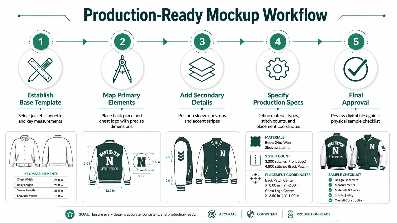
A production-ready mockup starts with a 1:1 template, not a loose digital draft. The garment silhouette has to come from the manufacturer's spec sheet so the placement decisions match the actual body block, the precise shoulder angle, and the correct panel proportions. Once that base exists, every element gets placed as its own labeled layer, so the shop can separate the chenille letter, embroidered mark, and patch art without guessing.
Build the file like a shop will read it
Use separate artboards or clearly labeled layers for each zone. Put exact X/Y coordinates on the file using the center-front seam and shoulder seam as your anchors, then add stitch type, patch dimensions, and thread color notes right on the page. If the digitizer has to ask whether the back piece is chenille, tackle twill, or embroidery, the file wasn't finished.
The best mockups read like instructions, not inspiration boards.
Color control matters just as much as placement control. Thread calls should be specified with a real system such as Pantone or Madeira, and the art file should tell the shop what material lives where. That keeps the production team from substituting surfaces that change the texture or thickness of the final jacket.
Test the art on a physical blank
The smartest step is still the old one, print the mockup at actual size and tape it to a jacket blank. That's where proportions reveal themselves. A back wordmark can feel balanced on screen and still sit too low on the garment, and a chest crest can look perfect until it lands over a seam allowance that eats part of the mark.
Graded placement sheets should be created for the full run, from S through XXL or whatever size span the order needs. The coordinates shift proportionally, but the hierarchy stays the same, the chest anchor remains the chest anchor, and the back remains centered in relation to the collar and yoke. If you don't grade the placements, you're asking one set of coordinates to do a job meant for several body blocks.
Common Layout Mistakes and How to Fix Them
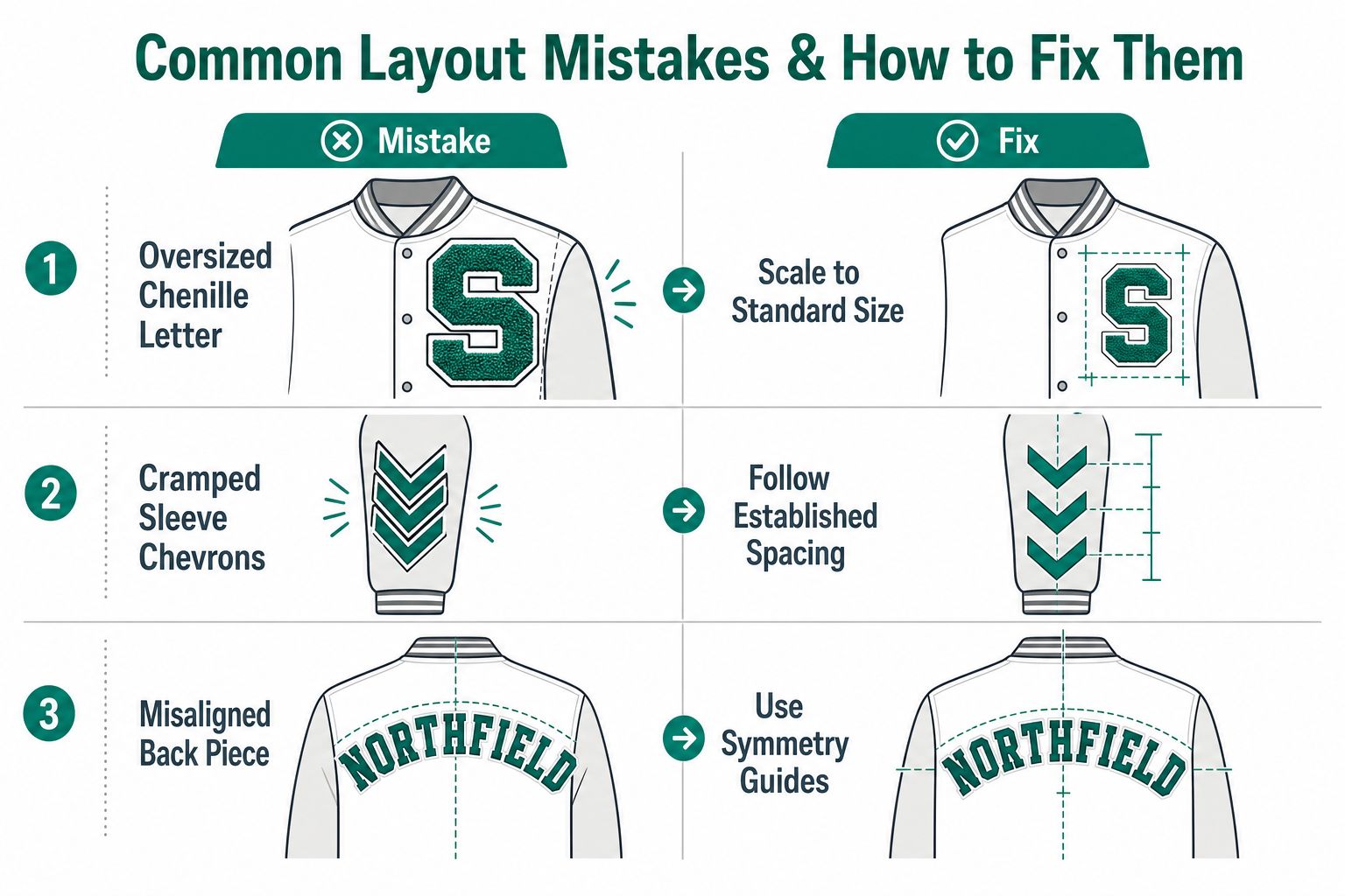
The costly mistakes are the ones that look minor in a file and obvious on a body. A chest graphic that's too large, a sleeve patch set too low, or a back piece that ignores seam allowance can turn a strong design into a repair job. Good layout work keeps the artwork inside the garment's usable space and respects the placement matrix the shop will use.
The chest can't do everything
Overstacking the left chest is the fastest way to kill the silhouette. Once too many patches crowd the same zone, the eye stops reading hierarchy and starts reading clutter. Keep the chest composition disciplined and leave room so each mark can be recognized without overlapping the next.
The collar area needs the same restraint. The rib-knit collar creates a dead zone where patches and lettering should not sit, because that area flexes and shifts too much to hold clean structure. If the art creeps into that boundary, the jacket looks placed by feel instead of planned for production.
Sleeve and back errors are usually spacing errors
Sleeve patches fail when dropped below the upper-third zone established in the placement matrix. At that point, the arm bend works against the design and the patch reads poorly in motion.
The back piece usually misses for a different reason, it ignores the center-back seam allowance and starts wrapping over the yoke. That breaks symmetry fast. Center the back art with the neckline-to-logo-center method and keep it below the yoke line, and the composition stays readable from a distance without fighting the jacket structure.
A practical audit helps before approval:
- Check left-chest crowding: Leave breathing room so the main mark does not run into the armhole seam.
- Hold the collar dead zone: Keep applied elements away from the rib-knit edge.
- Keep sleeves high enough: Use the upper third, not the low arm area.
- Center the back deliberately: Align to seam and yoke, not to the flat artboard alone.
Final Pre-Production Checklist for a Clean Layout
A jacket file can look finished on screen and still fail at the shop. Before it goes to the hoop, check vector integrity, thread specs, and every spot where art could cross a seam or rib boundary. The production package should also include a legend, a coordinate grid, and a signed approval form, so the shop is not guessing from the artwork.
Three things to confirm before approval
Design integrity comes first. Every patch file should stay clean, readable, and sized for the actual garment, not the flat mockup. Color calls need to match the thread inventory, and the stitch plan should be clear enough that the digitizer does not have to make creative choices.
Sizing accuracy is the second gate. Graded placement sheets should exist for each size in the run, because a layout that works on one block can drift on another. Recheck the collar edge, seam lines, and rib-knit boundary, then adjust the placement if the jacket block changes.
Shop communication closes the loop. Send the mockup with notes, coordinates, and a clear approval trail. I also recommend one mid-range sample jacket before full production, because that sample shows whether the layout sits correctly on the garment or only looked right in a file.
The same standard applies when you review outerwear frames in the broader catalog, including the letterman jacket frame guide, because frame decisions and placement decisions affect each other once production starts.
A clean letterman jacket layout is controlled, not crowded. If you are planning a run and want outerwear that is easier to place, preview, and build within real production constraints, review the frame guide before you finalize your next layout.